A Woman’s Home Office
Generally, a home office is dark & masculine with the man of the house in mind. But, why shouldn’t we design a woman’s home office with a feminine touch?
When a local client contacted me to finally pull the trigger on their home office I was thrilled! I had been working with them since 2008 on just about every room in their home and this was one I was dying to dive into. Let me tell you why…. it was the first room on the left when you walked in the foyer, it was dark and cave-like and definitely designed with a man in mind, and She was the President of a Charity she founded years ago as a memorial to their neighbors young son who had passed away of a rare cancer. This before photo, shows you the space she was planning golf outings and grand galas for several years and I knew she deserved a space that would honor her for the wonderful gesture she paid to her neighbors and all the children suffering from this rare type of cancer.
When designing a woman’s home office it’s important to list out your objectives before going to town on selecting materials and furniture.
Let’s start with storage…
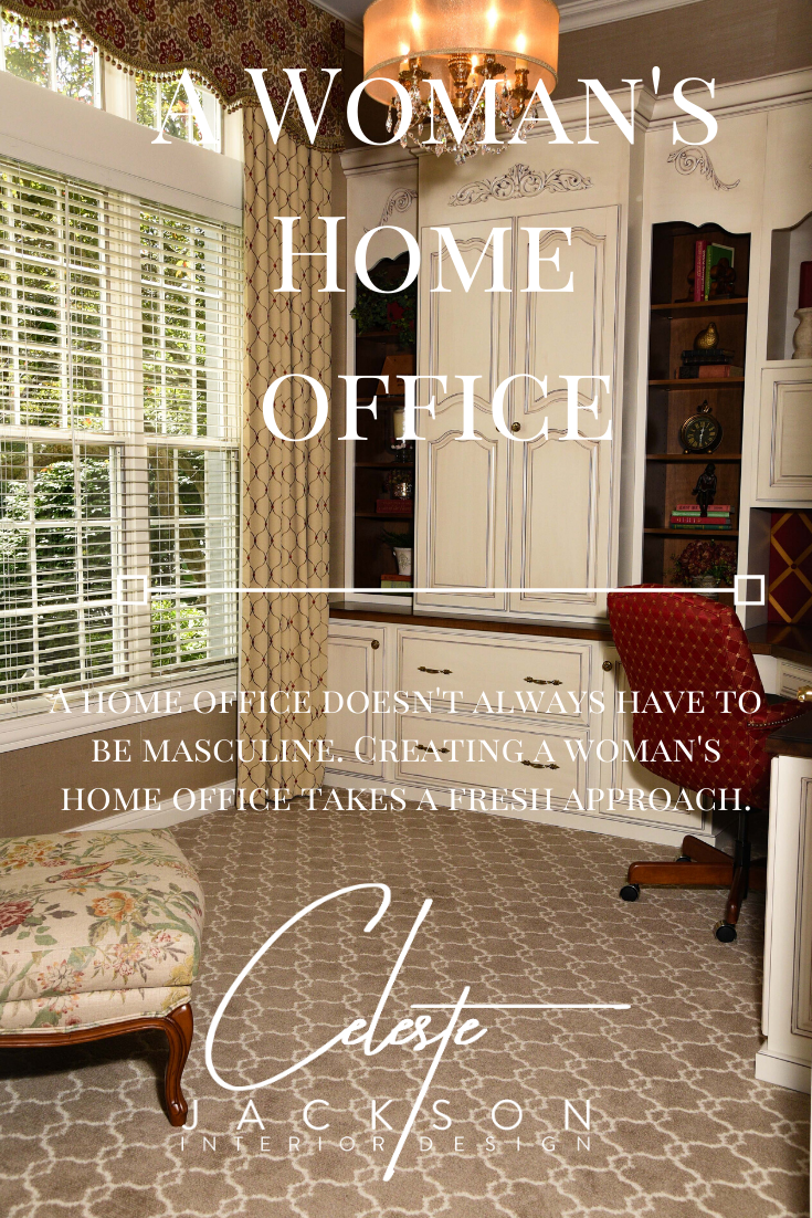
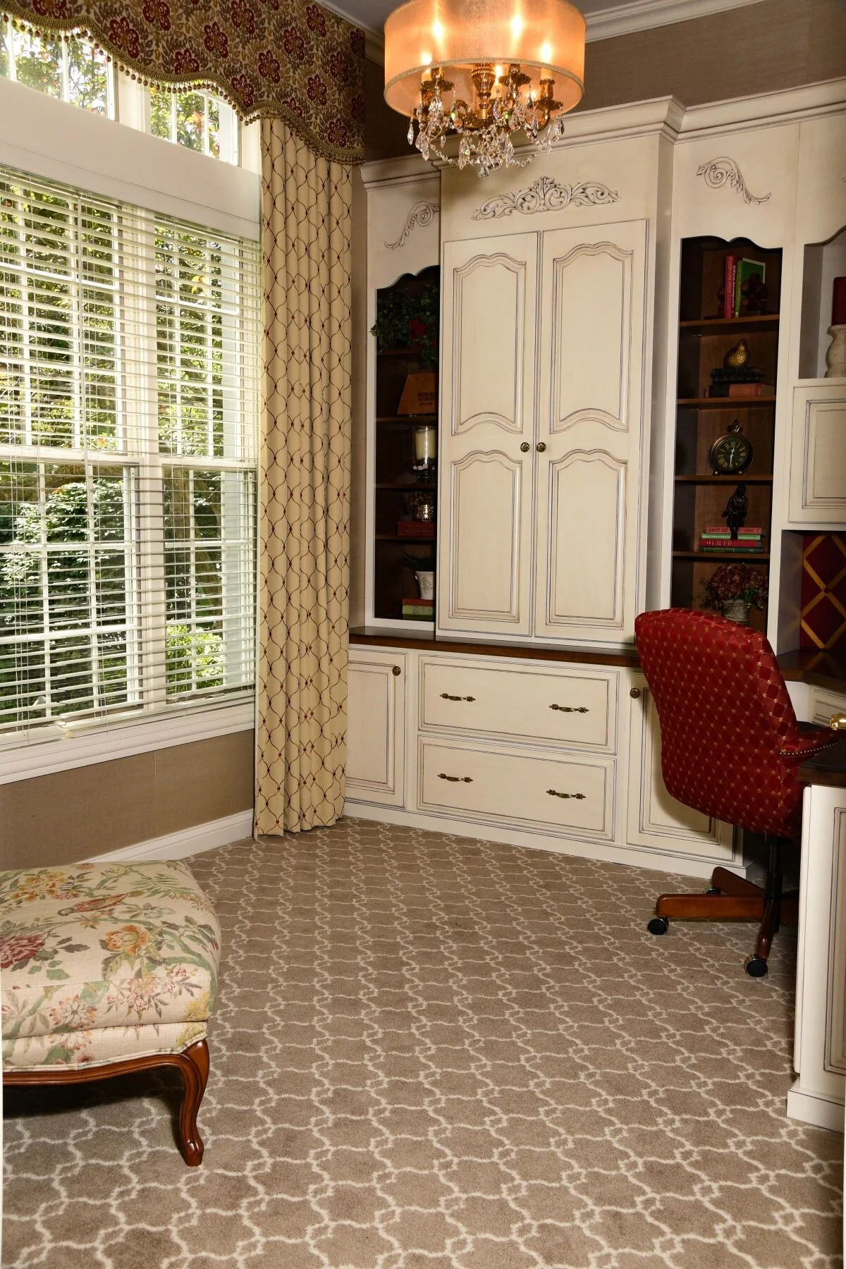
My client needed file drawers, closed storage to hide away binders, places to store office essentials such as scotch tape, a stapler, pens & pencils and markers, paper and of course a printer. A women’s home office should be beautiful and organized so you can focus on the task at hand and that’s what she wanted. As you can see here we created plenty of good storage yet have open shelves to accessorize.
The cabinet door design was inspired by a piece of furniture I have in my master bedroom. I had this in mind for many years prior to starting this project. I loved the softness of the scallop raised panel and knew that she would too!
Once I had the design & layout down I had the cabinetry quoted by an Amish Cabinet maker I had been using for many years. I find his quality extraordinary and pricing reasonable. For years many of us thought of Amish Furniture and we pictured heavy oak. Not any more! I have even worked on contemporary projects with them that have turned out beautifully. Many of the Amish Cabinet makers have websites now so you can find them more easily online than you could in the past.
The carved detailing added elegance & dimension to the cabinetry. I found these from Van Dyke’s Restorers, an online vendor for a variety of products including wood moldings.
Next up, lighting…
Part of the problem with this space looking cave-like in it’s previous life was that there was no ceiling fixture. That’s a no-no in any home office! With the ceiling height at almost 11 feet tall there was no reason not to add one. So why not an updated chandelier? This one, from Crystorama has a drum shade that softens the glow. The perfect touch!
I was there overseeing the window treatment installation when my clients brother & electrician came to install it. Since there is attic space above we thought it would be easy but it presented it’s challenges. In the end he was able to make it work, thank goodness! What a difference it makes.
He also added under-cabinet lighting for highlighting her work-space & custom ribbon bulletin board for her to slide her photos & invitations in.
Aside from the natural light it was all she needed to create the perfect lighting. Of course, dimmers were installed to adjust the lighting for creating ambiance when they just want to admire the space from the other rooms.
For the floor…
We decided to stay with carpet, however, we didn’t want a thick plush like they had before. We settled on a patterned carpet from Masland Carpet one of my favorite carpet lines, this one is called Moroccan Impressions. It is the perfect thickness for rolling her office chair and adds a lot of style in this space.
What about the Walls …
People always ask me if wallpaper is in again, I say it’s never out! I do think that some people have gotten carried away with wallpaper in the past, especially in the Waverly era…Yikes! It’s all in knowing when it’s a good idea and when it’s just too much. In this case I felt some texture was just what the space needed. We went with a Sisal Wallcovering by Schumacher a long standing company & one of my favorites, who have been around since 1889 yet have evolved over the years. This one is called Suwon Sisal in color Champagne. Sisal is similar to grasscloth. It’s great for a space like a women’s home office. It’s not something you want to use in a bathroom or kitchen where water and steam can damage it.
Finally, Furniture ,Window Treatment & Accessories…
We honestly didn’t need much furniture just a desk chair & this lovely classic style French Bergere chair & ottoman. At this point you might be asking “What was her husband thinking of all this?” LOL, right? Funny thing is he was loving it as much as she was! It turns out that his Mother, had incredible style and in fact, she had a set of Bergere Chairs that he always admired as a young man.
The lesson here is… don’t underestimate what the man in your life might appreciate.
In my world, the fabric often inspires a space & the window treatment often finishes a space. That was certainly the case here. I almost, always select the fabric for a space first and make many of my selections in the design process around how it will look with the fabric. I’m definitely a textile person, to me it’s the fashion statement to build around. In this case, we decided on natural cotton fabrics with embroidered details. Both fabrics are from Carole Fabrics, a value driven textile line from Augusta, Georgia who have been in business since 1958. Since the cabinetry has so much detail, we went with a simple, classic cornice with ball fringe and stationary side panels.
Shopping for accessories for this space was like going to a candy store. Another one of my favorite things about being an Interior Designer! Books, bookends, figurines all things that reflected who my client is as a person. Those details enhance the character in a space and in the end made this a perfect woman’s home office.


